

Visualizing US Arrests with Hierarchical Clustering and t-SNE
Clustering techniques are powerful tools for uncovering hidden patterns in data. In the field of machine learning, they help us group similar data points without prior labels. While K-Means is an effective and widely used clustering algorithm, as discussed in the previous blog post , it has limitations, such as requiring the number of clusters to be predefined.
To build on that analysis, we’ll explore hierarchical clustering, which offers a more flexible approach by revealing cluster structures at multiple levels. Additionally, we’ll leverage t-Distributed Stochastic Neighbor Embedding (t-SNE), a powerful dimensionality reduction technique to visualize the complex relationships within the data.
Using the US Arrests dataset, which contains crime statistics for each U.S. state, we’ll identify natural groupings and analyze regional crime trends. By comparing hierarchical clustering with K-Means and enhancing our visual understanding with t-SNE, we aim to gain deeper insights into crime patterns across the United States.
Table of Contents
Understanding the US Arrests Dataset
This dataset captures arrest rates per 100,000 residents for three major crimes—assault, murder, and rape—across all 50 U.S. states in 1973. Additionally, it includes the percentage of the population living in urban areas (UrbanPop), offering insights into how crime correlates with urbanization.
Why This Dataset?
- Structured for clustering: The numeric features (arrest rates) allow us to group states with similar crime profiles.
- Temporal snapshot: The 1973 data provide a historical lens, revealing trends before modern policing reforms.
- Urban-rural dynamics: UrbanPop lets us explore whether crime rates scale with city density.
How We’ll Use It
By applying hierarchical clustering, we’ll identify natural groupings of states with comparable crime patterns. Later, t-SNE will help visualize these relationships in 2D, validating whether clusters align with geographic or socioeconomic trends.
Hierarchical Clustering Explained
Hierarchical clustering is an unsupervised machine learning algorithm used to group unlabeled data points based on their similarity. Like K-Means clustering, it aims to find natural clusters in the data. However, a key difference is that hierarchical clustering does not require specifying the number of clusters (K) in advance, making it more flexible for exploratory analysis.
Unlike K-Means, which assigns points to fixed clusters, hierarchical clustering produces a tree-like structure called a dendrogram. This structure allows us to see how clusters are formed at different levels, making it easier to analyze relationships between data points.
Types of Hierarchical Clustering
Hierarchical clustering comes in two main flavors:
- Agglomerative (Bottom-Up)
This is the most common approach. It starts by treating each data point as its own cluster, then iteratively merges the closest pairs of clusters until all points belong to a single cluster. This process is visualized in a dendrogram, where lower branches represent smaller clusters that merge into larger ones. - Divisive (Top-Down)
Less commonly used, this method starts with all data points in one large cluster and recursively splits them into smaller clusters. It continues dividing until each data point is in its own individual cluster.
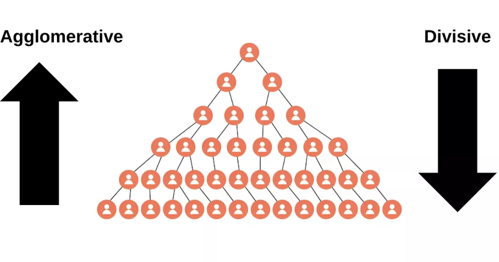
Agglomerative clustering is widely supported in libraries like scikit-learn .
Loading and Preparing the Data
Before diving into analysis, we need to ensure our dataset is structured and standardized for accurate modeling. The US Arrests dataset comes in a tabular format, with states as rows and crime statistics (murder, assault, rape) alongside urban population percentages as columns.To ensure reproducibility, we’ll programmatically download the dataset directly from its source (like a GitHub repository or data portal) using Python’s requests library. This approach eliminates manual file handling and guarantees that readers work with the latest version. While the US Arrests dataset is small, automating downloads is especially valuable for bigger or frequently updated datasets.
import requests
import pandas as pd

link="https://github.com/selva86/datasets/raw/master/USArrests.csv"
request = requests.get(link)
request.raise_for_status()

with open("USArrests.csv", "wb") as file:
     file.write(request.content)

df=pd.read_csv('USArrests.csv', index_col='State')
print(df.head())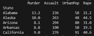
Since clustering algorithms rely on distance calculations, we’ll need to standardize the data before applying clustering algorithms. Standardization ensures that each feature contributes equally to the distance calculations, preventing features with larger values from dominating the results. This preparation phase ensures our hierarchical clustering and t-SNE visualizations reflect true patterns, not artifacts of uneven scales.
print(df.describe())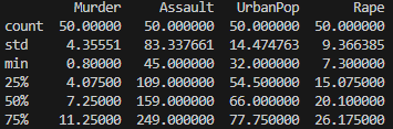
The df.describe() output reveals critical patterns in U.S. crime statistics 1973:
1. Crime Rate Variations
- Murder:
- Ranges dramatically from 0.8 (lowest, e.g., North Dakota) to 17.4 (highest, e.g., Georgia) arrests per 100k.
- 50% of states fall between 4.1–11.3 (25th–75th percentile), indicating moderate skewness (mean=7.8 > median=7.2).
- Assault:
- Extremely wide spread (45–337 arrests), with a high standard deviation (83.3).
- The gap between median (159) and 75th percentile (249) suggests right-skewed distribution—a few states have exceptionally high assault rates.
- Rape:
- Less variability than assault but still significant (7.3–46.0 arrests).
- Mean (21.2) ≈ median (20.1), suggesting a near-symmetric distribution.
2. Urban Population (UrbanPop)
- Relatively balanced (32–91%), with most states clustered around the mean (65.5%).
- Small standard deviation (14.5) compared to crime metrics.
3. Data Quality
- No missing values (count=50 for all columns).
- Outliers likely exist:
- Max assault rate (337) is ~4x the 25th percentile (109).
- Max rape rate (46) is double the 75th percentile (26.2).
Why This Matters for Clustering
- Scaling is essential: Assault rates dominate numerically (max=337 vs. murder’s max=17.4). Without standardization, clustering would overweight assault.
- Potential subgroups: The wide ranges in crime metrics suggest natural clusters (e.g., high-murder vs. high-assault states).
- UrbanPop’s role: Its tighter distribution may play a smaller role in clustering unless weighted.
Standardizing the Data for Clustering
Using StandardScaler, we’ll transform each feature to have a mean of 0 and a standard deviation of 1, preserving the underlying patterns while creating a level playing field for our distance-based algorithms. This step is critical for hierarchical clustering, where Euclidean distances directly influence the merging of clusters.
from sklearn.preprocessing import StandardScaler

standard_scaler =StandardScaler()
scaled_data= standard_scaler.fit_transform(df)
Applying Hierarchical Clustering to the Data
With our data standardized and ready, we can now apply hierarchical clustering. This method works by measuring the distance between data points and progressively merging the closest pairs of clusters. The result is a dendrogram, a tree-like diagram that shows the nested grouping of states based on their crime profiles. In this section, we’ll use SciPy’s linkage and dendrogram functions to construct and visualize the clustering hierarchy.
While the agglomerative approach provides a framework for building clusters, the choice of linkage method critically shapes the hierarchical structure. Different linkage criteria such as Ward’s, complete, or single measure cluster proximity in distinct ways, often yielding meaningfully different groupings for the same data. Let’s examine how these methods alter our interpretation of crime patterns:
Single Linkage
Single Linkage defines the distance between two clusters as the minimum distance between any single point in one cluster and any point in the other. In other words, it considers the closest pair of points between the two clusters.
This method tends to create elongated or chain-like clusters, which can be useful in some cases but may also lead to less compact groupings..
from scipy.cluster.hierarchy import dendrogram, linkage
import matplotlib.pyplot as plt

merging= linkage(scaled_data, method='single')
plt.figure(figsize=(20,6))
dendrogram(merging, labels=df.index, leaf_rotation=90, leaf_font_size=10)
plt.title("Crime Rates Clustered Hierarchically")
plt.tight_layout()
plt.show()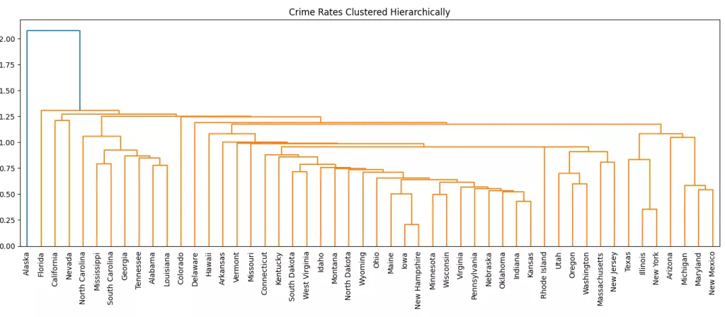
Average Linkage
Average Linkage calculates the distance between two clusters as the average of all pairwise distances between points in the two clusters.
This method offers a balance between single and complete linkage. It avoids the chaining effect of single linkage and the tight, compact clusters of complete linkage, often resulting in more natural and moderate cluster shapes.
from scipy.cluster.hierarchy import dendrogram, linkage
import matplotlib.pyplot as plt

merging= linkage(scaled_data, method='average')
plt.figure(figsize=(20,6))
dendrogram(merging, labels=df.index, leaf_rotation=90, leaf_font_size=10)
plt.title("Crime Rates Clustered Hierarchically")
plt.tight_layout()
plt.show()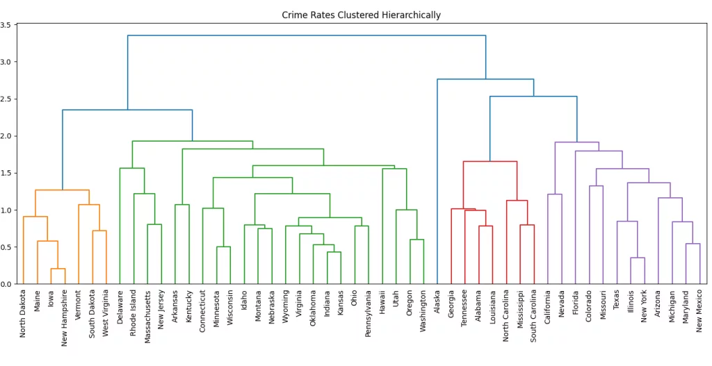
Complete Linkage
Complete Linkage measures the distance between two clusters as the maximum distance between any point in one cluster and any point in the other. In other words, it considers the farthest pair of points when merging clusters.
This method tends to create compact and spherical clusters, avoiding the chaining effect of single linkage. However, it can be sensitive to outliers.
from scipy.cluster.hierarchy import dendrogram, linkage
import matplotlib.pyplot as plt

merging= linkage(scaled_data, method='complete')
plt.figure(figsize=(20,6))
dendrogram(merging, labels=df.index, leaf_rotation=90, leaf_font_size=10)
plt.title("Crime Rates Clustered Hierarchically")
plt.tight_layout()
plt.show()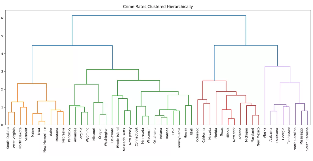
Ward's Linkage
Ward’s Linkage is a variance-based method that minimizes the within-cluster variance when merging clusters. It calculates the increase in total variance when two clusters are merged and selects the pair of clusters that results in the smallest increase in variance.
This method often produces compact and spherical clusters by attempting to minimize the spread of points within each cluster. It is widely used when the goal is to create well-balanced clusters, especially when the data has a clear structure.
from scipy.cluster.hierarchy import dendrogram, linkage
import matplotlib.pyplot as plt

merging= linkage(scaled_data, method='ward')
plt.figure(figsize=(20,6))
dendrogram(merging, labels=df.index, leaf_rotation=90, leaf_font_size=10)
plt.title("Crime Rates Clustered Hierarchically")
plt.tight_layout()
plt.show()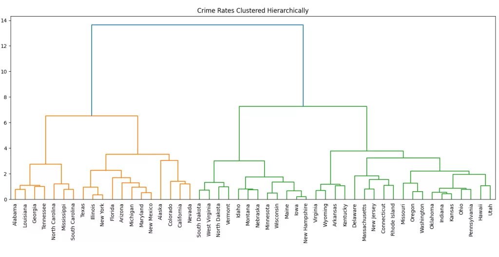
Cutting the Dendrogram: Determining the Right Number of Clusters
Determining the optimal number of clusters from a dendrogram involves visually inspecting the tree structure and identifying where the tree should be “cut” to form distinct clusters.
The dendrogram shows how the US states are hierarchically clustered based on their crime rate profiles using Ward’s linkage. Each merge (or “U”-shaped line) represents a cluster being formed. The height of the merge indicates the distance (or dissimilarity) between the merged clusters.
You can determine the optimal number of clusters by looking for the largest vertical jump in the dendrogram that isn't crossed by a horizontal line. In this case, there's a notable jump around the height of 10, where the tree splits into two major branches (left and right).
If you draw a horizontal line at that height, it would cut the dendrogram into two main clusters, which suggests that grouping the states into two clusters might be a meaningful choice. These two clusters could represent, for example:
- States with generally higher crime rates
- States with generally lower crime rates
You could also experiment with cutting the dendrogram at a lower height (say ~7) to get 3 or 4 clusters, which might give you more granularity while still maintaining meaningful groupings.
The cluster labels for any intermediate stage of the hierarchical clustering can be extracted using the fcluster function from the scipy.cluster.hierarchy module. This function allows us to “cut” the dendrogram at a specific level, either by specifying a maximum number of clusters or by setting a threshold distance. Based on this cut, fcluster assigns a flat cluster label to each data point, making it possible to analyze and visualize the grouping at any stage of the hierarchy.
from scipy.cluster.hierarchy import linkage, fcluster

scaled_data= standard_scaler.fit_transform(df)
merging= linkage(scaled_data, method='ward')
labels= fcluster(merging,t=8, criterion='distance')

df['cluster_labels']= labels
print(df[['cluster_labels']])
#Output:
#                      cluster_labels
#State
#Alabama                      1
#Alaska                       1
#Arizona                      1
#Arkansas                     2
#California                   1
#Colorado                     1
#Connecticut                  2
#Delaware                     2
#Florida                      1
#Georgia                      1
Visualizing Cluster Differences with Boxplots
To better understand how the clusters differ in terms of crime statistics, we can visualize the distribution of each feature within the clusters using boxplots. The sns.boxplot() function from the Seaborn library is particularly useful for this task, as it allows us to clearly compare the spread, median, and outliers of each variable across clusters.
For example, by plotting the Murder rate for each cluster, we can quickly observe whether certain clusters are associated with higher or lower rates of violent crime. Repeating this for other variables such as Assault, and Rape helps build a clearer picture of the defining characteristics of each group. These insights can be valuable for interpreting what each cluster represents—such as distinguishing between states with generally low crime versus those with elevated levels in specific categories.
By using boxplots, we not only validate the clustering results but also uncover the underlying patterns and differences that might not be immediately visible from raw data or cluster labels alone.
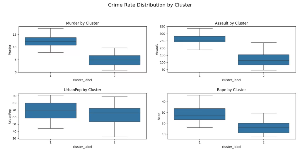
From the boxplots, we can observe a clear pattern:
- Cluster 1 consistently shows higher median values for violent crimes, especially Murder, Assault, and Rape.
- Cluster 2 on the other hand, tends to include states with lower crime rates, as seen in the much lower median values across all features.
- UrbanPop differences are also visible, but less distinct than the others suggesting that population urbanization may not be the most decisive factor in clustering.
These visual comparisons not only help us validate the clustering but also reveal the story behind the data: states in Cluster 1 seem to face higher crime rates, while those in Cluster 2 appear relatively safer.
How Do Crime Patterns Look in 2D? t-SNE Has the Answer
While dendrograms give us a detailed view of how clusters are formed hierarchically, they can be a bit abstract when it comes to understanding the spatial relationships between data points. To better visualize the clustering results, we can use t-distributed stochastic neighbor embedding (t-SNE).
It has a complicated name, but it serves a very simple purpose. It maps samples from their high-dimensional space into a 2- or 3-dimensional space so they can visualized. While some distortion is inevitable, t-SNE does a great job of approximately representing the distances between the samples. For this reason, t-SNE is an invaluable visual aid for understanding a dataset.
from sklearn.manifold import TSNE

model= TSNE(learning_rate=100, random_state=42)
tsne_data= model.fit_transform(scaled_data)
xs= tsne_data[:, 0]
ys= tsne_data[:, 1]

plt.scatter(xs, ys, c=df['cluster_label'], cmap="cividis", s=100)

# Add annotations (state names)
for i, state in enumerate(df.index):  # or df['State'] if it's a column
    plt.text(tsne_data[i, 0]+0.05, tsne_data[i, 1], state, fontsize=8)


plt.title("t-SNE Visualization of Clusters")
plt.show()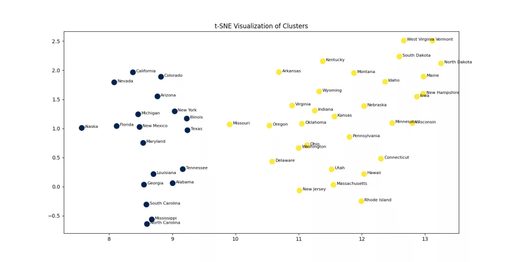
The t-SNE visualization above projects the high-dimensional crime data into a two-dimensional space, making it easier to visually assess the separation between clusters. Each point represents a U.S. state, and the colors indicate the cluster assignments based on hierarchical clustering. The clear separation between the two groups suggests that the algorithm was able to capture meaningful distinctions in the crime profiles across states. While t-SNE doesn't preserve global distances, it excels at preserving local structure, which helps us understand how closely related states are in terms of their crime patterns.
Conclusion
In this post, we explored how hierarchical clustering and t-SNE can be powerful tools for understanding and visualizing complex datasets like U.S. crime statistics. Hierarchical clustering allowed us to uncover natural groupings among states without needing to predefine the number of clusters, while t-SNE gave us an intuitive visual representation of these groupings in two dimensions. Together, they offer a compelling approach to both analysis and storytelling through data.
This next section may contain affiliate links. If you click one of these links and make a purchase, I may earn a small commission at no extra cost to you. Thank you for supporting the blog!
References
Hands-On Machine Learning with Scikit-Learn, Keras, and TensorFlow
Introduction to Machine Learning with Python: A Guide for Data Scientists
Python Machine Learning By Example: Unlock machine learning best practices with real-world use cases
FAQs
What’s the main difference between K-Means and Hierarchical Clustering?
K-Means requires you to predefine the number of clusters (K), while hierarchical clustering builds a tree (dendrogram) of clusters without needing to specify K upfront.
How do I choose the right number of clusters in hierarchical clustering?
You can visually inspect the dendrogram and use a horizontal cut to determine the optimal number of clusters based on the longest vertical lines that do not cross any other merges.
What is the role of linkage in hierarchical clustering?
The linkage method determines how distances between clusters are calculated. Common methods include single, complete, average, and Ward’s linkage. Each produces a different clustering structure.
Why use t-SNE for visualization?
t-SNE helps reduce high-dimensional data into 2D or 3D for visualization, preserving local structures and making cluster patterns easier to spot.
Can I use hierarchical clustering on large datasets?
Hierarchical clustering can be computationally intensive for large datasets. For very large datasets, consider using K-Means or DBSCAN for scalability.


