

Principal Component Analysis in Machine Learning: A Simple Hands-On using Breast Cancer Dataset
In my last post, I played around with the US Arrests dataset and used t-SNE to visualize it in a lower-dimensional space. t-SNE gave us a cool way to “see” high-dimensional data in just two dimensions, revealing patterns we wouldn’t notice otherwise. This time, I’m taking a closer look at another popular dimensionality reduction technique: Principal Component Analysis (PCA). We’ll use the Breast Cancer dataset from scikit-learn and walk through how PCA works, how to apply it in Python, and how it can help simplify data before feeding it into a machine learning model.
Table of Contents
Why Bother Reducing Dimensions Anyway?
Dimensionality reduction simplifies complex datasets by identifying underlying patterns and re-encoding the data into a more compact form. While this compression streamlines computation, a critical advantage for big data, its true power lies in distilling datasets to their essential features. By discarding redundant and noisy variables, these techniques:
- Improve predictive performance: Eliminate features that mislead supervised learning (e.g., regression/classification).
- Uncover latent structure: Reveal hidden relationships (e.g., t-SNE’s nonlinear patterns).
- Enable otherwise impossible analyses: Make high-dimensional data tractable for modeling.
In practice, dimensionality reduction isn’t just an optimization step; it’s often the bridge between raw data and actionable insights, especially for modern datasets with hundreds of features.
What is Principal Component Analysis (PCA)?
Principal Component Analysis (PCA) is a technique used to simplify complex datasets. It does this by transforming the data into a new set of variables called principal components that capture the most important patterns in the original data.
The idea is to reduce the number of features (or dimensions) while preserving as much of the original variation as possible. This makes it easier to visualize the data, speeds up machine learning models, and often improves performance by removing noise and redundancy.
Here’s how it works at a high level:
- De-correlation: PCA rotates the original features so they’re uncorrelated with each other. This helps remove redundancy. In fact, it does more than this: PCA also shifts the samples so that they have mean zero.
- Projection: It then selects the top k principal components; those that explain the most variance; and discards the rest, effectively reducing the dimensionality.
For example, if your dataset has 30 features (like the breast cancer dataset), PCA might reduce it to just 2 or 3 components that still capture most of the useful information.
The end result? A simpler version of your data that’s easier to work with and often performs better in machine learning models.
PCA in Action: Applying It to the Breast Cancer Dataset
To see PCA in action, we’ll use the Breast Cancer Wisconsin dataset, which comes built-in with scikit-learn. This dataset contains 30 numeric features computed from digitized images of breast tissue samples, such as mean radius, texture, perimeter, and more. Each sample is labeled as either malignant (cancerous) or benign (non-cancerous), making it a common go-to for classification tasks.
from sklearn.datasets import load_breast_cancer

data= load_breast_cancer()
print(data.DESCR)

#Output:
# .. _breast_cancer_dataset:

# Breast cancer wisconsin (diagnostic) dataset
# --------------------------------------------

# **Data Set Characteristics:**

# :Number of Instances: 569

# :Number of Attributes: 30 numeric, predictive attributes and the class

# :Attribute Information:
#     - radius (mean of distances from center to points on the perimeter)
#     - texture (standard deviation of gray-scale values)
#     - perimeter
#     - area
#     - smoothness (local variation in radius lengths)
#     - compactness (perimeter^2 / area - 1.0)
#     - concavity (severity of concave portions of the contour)
#     - concave points (number of concave portions of the contour)
#     - symmetry
#     - fractal dimension ("coastline approximation" - 1)

#     The mean, standard error, and "worst" or largest (mean of the three
#     worst/largest values) of these features were computed for each image,
#     resulting in 30 features.  For instance, field 0 is Mean Radius, field
#     10 is Radius SE, field 20 is Worst Radius.

#     - class:
#             - WDBC-Malignant
#             - WDBC-Benign

# :Summary Statistics:

# ===================================== ====== ======
#                                         Min    Max
# ===================================== ====== ======
# radius (mean):                        6.981  28.11
# texture (mean):                       9.71   39.28
# perimeter (mean):                     43.79  188.5
# area (mean):                          143.5  2501.0
# smoothness (mean):                    0.053  0.163
# compactness (mean):                   0.019  0.345
# concavity (mean):                     0.0    0.427
# concave points (mean):                0.0    0.201
# symmetry (mean):                      0.106  0.304
# fractal dimension (mean):             0.05   0.097
# radius (standard error):              0.112  2.873
# texture (standard error):             0.36   4.885
# perimeter (standard error):           0.757  21.98
# area (standard error):                6.802  542.2
# smoothness (standard error):          0.002  0.031
# compactness (standard error):         0.002  0.135
# concavity (standard error):           0.0    0.396
# concave points (standard error):      0.0    0.053
# symmetry (standard error):            0.008  0.079
# fractal dimension (standard error):   0.001  0.03
# radius (worst):                       7.93   36.04
# texture (worst):                      12.02  49.54
# perimeter (worst):                    50.41  251.2
# area (worst):                         185.2  4254.0
# smoothness (worst):                   0.071  0.223
# compactness (worst):                  0.027  1.058
# concavity (worst):                    0.0    1.252
# concave points (worst):               0.0    0.291
# symmetry (worst):                     0.156  0.664
# fractal dimension (worst):            0.055  0.208
# ===================================== ====== ======

# :Missing Attribute Values: None

# :Class Distribution: 212 - Malignant, 357 - Benign

# :Creator:  Dr. William H. Wolberg, W. Nick Street, Olvi L. Mangasarian

# :Donor: Nick Street

# :Date: November, 1995

# This is a copy of UCI ML Breast Cancer Wisconsin (Diagnostic) datasets.
# https://goo.gl/U2Uwz2

# Features are computed from a digitized image of a fine needle
# aspirate (FNA) of a breast mass.  They describe
# characteristics of the cell nuclei present in the image.

# Separating plane described above was obtained using
# Multisurface Method-Tree (MSM-T) [K. P. Bennett, "Decision Tree
# Construction Via Linear Programming." Proceedings of the 4th
# Midwest Artificial Intelligence and Cognitive Science Society,
# pp. 97-101, 1992], a classification method which uses linear
# programming to construct a decision tree.  Relevant features
# were selected using an exhaustive search in the space of 1-4
# features and 1-3 separating planes.

# The actual linear program used to obtain the separating plane
# in the 3-dimensional space is that described in:
# [K. P. Bennett and O. L. Mangasarian: "Robust Linear
# Programming Discrimination of Two Linearly Inseparable Sets",
# Optimization Methods and Software 1, 1992, 23-34].

# This database is also available through the UW CS ftp server:

# ftp ftp.cs.wisc.edu
# cd math-prog/cpo-dataset/machine-learn/WDBC/
The goal here isn’t to build a classifier just yet, but to use PCA to reduce the dimensionality of the data. We'll try to capture most of the variance using fewer features, and visualize how well the reduced representation separates the two classes.
Once we load the dataset, we can convert the data into a Pandas DataFrame for easier inspection and manipulation:
import pandas as pd

df= pd.DataFrame(data.data, columns=data.feature_names)
df['target'] = data.target
Are the Features Correlated? Let’s Find Out
Before we run PCA, let’s check if the features are correlated. PCA works best when features have linear relationships and in fact, one of the main things it does is remove that correlation by rotating the feature space. We can measure this using the Pearson correlation coefficient, which tells us how strongly two variables are linearly related.
When we compute the correlation matrix for the features in the Breast Cancer dataset, we see that many features are highly correlated.
from scipy.stats import pearsonr

print(pearsonr(df["mean radius"] ,df['mean area']).statistic)
#Output:
#0.9873571700566122
This indicates a very strong linear relationship in fact, some features are nearly redundant. This redundancy is what PCA is designed to reduce. To get a better picture, we can visualize the scatter plot of the features.
import seaborn as sns

sns.scatterplot(x=df['mean radius'], y=df['mean area'])
plt.xlabel('Mean Radius')
plt.ylabel('Mean Area')
plt.title(f"Pearson Correlation: {pearsonr(df['mean radius'], df['mean area']).statistic:.2f}")
plt.show()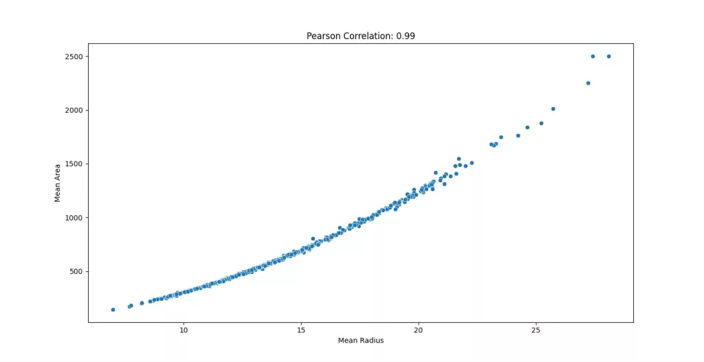
Why Standardization Matters for PCA?
PCA is affected by the scale of the data, so it’s standard practice to apply feature scaling before running it. Without scaling, features with larger values can unfairly dominate the principal components, skewing the results.
from sklearn.preprocessing import StandardScaler

X= df.drop('target', axis=1)
X_scaled= StandardScaler().fit_transform(X)
Understanding Variance and Intrinsic Dimension
Principal Component Analysis works by identifying directions in the data that capture the most variance, in other words, the directions where the data spreads out the most. Each principal component captures a certain amount of the total variance, and the more variance it captures, the more “important” it is in describing the structure of the dataset.
This brings us to the idea of intrinsic dimension: the true number of dimensions needed to represent the data without significant loss of information. While the original breast cancer dataset has 30 features, much of the variance can often be explained using far fewer components.
from sklearn.decomposition import PCA

pca= PCA()
pca.fit(X_scaled)

pca_features =range(pca.n_components_)
explained_variance= pca.explained_variance_

plt.figure(figsize=(10, 6))
plt.bar(pca_features, explained_variance)
plt.xticks(pca_features)
plt.xlabel('Principal Components')
plt.ylabel('Explained Variance')
plt.title("Variances of the PCA features")
plt.show()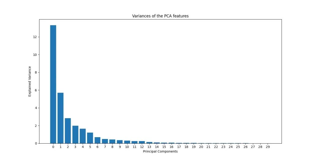
The bar chart below shows how much variance each principal component captures in the Breast Cancer dataset. As you can see, the first few components explain the vast majority of the variance with the first component alone carrying the most weight. This rapid drop-off is typical in high-dimensional data where many features are redundant or noisy.
Find the Optimal Number of Components
We define a threshold equal to 95% and find the smallest number of components that exceed it:
import numpy as np

explained_variance_ratio= pca.explained_variance_ratio_
# Number of components needed to explain 95% variance
threshold = 0.95  # Retain 95% of variance
n_components_95 = np.argmax(np.cumsum(explained_variance_ratio) >= threshold) + 1
print(f"Number of components to retain 95% variance: {n_components_95}")
#Output:
#Number of components to retain 95% variance: 10
Reducing Dimensions: Applying PCA with the Optimal Component Count
Once you've determined the optimal number of principal components to retain (e.g., by preserving 95% of the variance), the next step is to apply Principal Component Analysis (PCA) to reduce the dimensionality of your dataset.
By selecting the ideal number of components, you can transform your high-dimensional data into a lower-dimensional space while retaining the most important information. This transformation not only simplifies the data but also helps in speeding up computations and improving the performance of subsequent machine learning models.
With the reduced dataset, you can now proceed to visualize the data, identify potential patterns, and apply techniques like clustering or classification, all while working with a more efficient representation of the original data.
pca= PCA(n_components=10)

pca_components= pca.fit_transform(X_scaled)

first_component= pca_components[:, 0]
second_component= pca_components[:, 1]

plt.figure(figsize=(10, 6))
sns.scatterplot(x=first_component, y=second_component, hue=df['target'])

plt.title('PCA of Breast Cancer Dataset')
plt.xlabel('First Principal Component')
plt.ylabel('Second Principal Component')

plt.legend(title='Target')
plt.show()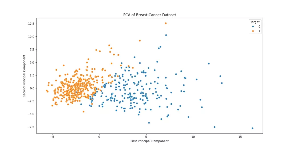
The scatter plot of the first two principal components reveals distinct patterns in the breast cancer dataset. The clear separation between benign (0) and malignant (1) cases along the first principal component (PC1) suggests that PC1 captures diagnostically significant variance likely related to key tumor characteristics like size or irregularity.
The moderate spread along PC2 indicates secondary contributing factors, though some overlap between classes implies these features alone may not perfectly discriminate all cases. Notably, if malignant samples cluster more densely (e.g., in the upper-right quadrant), this could reflect shared aggressive traits that confirm that these two components retain substantial structure from the original data, making them useful for preliminary visualization or as inputs for downstream classification models like SVM. For finer-grained analysis, incorporating additional components or nonlinear techniques (e.g., t-SNE) might further resolve overlapping regions.
Conclusion
In this blog post, we explored Principal Component Analysis (PCA), a fundamental technique for understanding and simplifying high-dimensional datasets. Here’s a summary of what we covered:
- Dimensionality Reduction Made Practical
- PCA transforms correlated features into a set of uncorrelated principal components, ranked by their contribution to the overall variance in the data.
- By focusing on the most significant components, we can reduce noise, speed up computations, and improve model performance all while preserving the essential structure of the data.
- Choosing the Right Number of Components
- We used the explained variance ratio to determine the intrinsic dimensionality of the dataset, selecting the fewest components needed to retain most of the information (e.g., 95% variance).
- This approach ensures efficiency without sacrificing critical patterns.
- Visualizing Insights
- Plotting the first two principal components revealed clear trends in the Breast Cancer dataset, demonstrating how PCA can highlight separability between classes (e.g., benign vs. malignant tumors).
- Such visualizations are invaluable for exploratory data analysis, helping us identify outliers, clusters, or potential biases before training models.
Why PCA Matters
- Interpretability: Principal components often align with meaningful real-world trends (e.g., tumor severity, customer behavior).
- Versatility: PCA is widely used in fields like bioinformatics, finance, and image processing.
- Foundation for Advanced Techniques: It sets the stage for other methods like clustering, anomaly detection, and even deep learning.
This next section may contain affiliate links. If you click one of these links and make a purchase, I may earn a small commission at no extra cost to you. Thank you for supporting the blog!
References
Hands-On Machine Learning with Scikit-Learn, Keras, and TensorFlow
Introduction to Machine Learning with Python: A Guide for Data Scientists
Python Machine Learning By Example: Unlock machine learning best practices with real-world use cases
Frequently Asked Questions:
What is PCA and why is it useful in medical datasets like breast cancer?
Principal Component Analysis (PCA) is a dimensionality reduction technique that transforms high-dimensional data into a lower-dimensional space while preserving as much variance (information) as possible. In medical datasets like breast cancer, where features can be numerous and sometimes correlated, PCA helps simplify the data, reduce noise, and improve the performance and interpretability of models.
How many features does the breast cancer dataset contain?
The Breast Cancer Wisconsin dataset contains 30 numerical features derived from digital images of a breast mass (e.g., mean radius, texture, perimeter, etc.). These features can be highly correlated, making it an ideal candidate for PCA.
Can PCA improve accuracy?
PCA itself doesn't directly improve accuracy, but it can enhance the performance of classification algorithms by reducing noise and multicollinearity in the data. When used before models like logistic regression, SVM, or k-NN, PCA often leads to more robust and generalizable predictions.
How many principal components are typically needed for breast cancer data?
This depends on how much variance you want to retain. In practice, retaining 95% of the variance often requires 5 to 10 components (out of the original 30). You can determine the exact number using the cumulative explained variance ratio from PCA.
Is PCA reversible? Can I get the original data back?
PCA is partially reversible. You can use inverse_transform to approximate the original data, but since some variance (information) is lost during dimensionality reduction, the reconstructed data won’t be exactly the same.


: A 101 Guide to This Simple Yet Powerful Supervised Learning Algorithm")